In short: a monthly-ish pick of UK charity Facebook ads (Meta to be precise) that caught my attention in the feed. This edition covers five – Centrepoint, Go Beyond, Médecins Sans Frontières, Mind and Humane World for Animals – with what each does well and what you could test. The common thread here: the strongest ads make a tangible / specific ask (a room, a £4 ice cream, £5 a month, a matched donation), and run time may be the clue to performance, not quite proof.
Each month I pull a handful of charity ads out of my feed and the Meta Ad Library and take them apart – not to crown “winners” (we can’t see anyone’s donation data from the outside), but to show what’s worth noticing and what you might test on your own account.
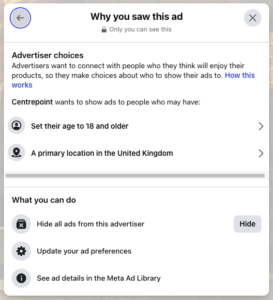
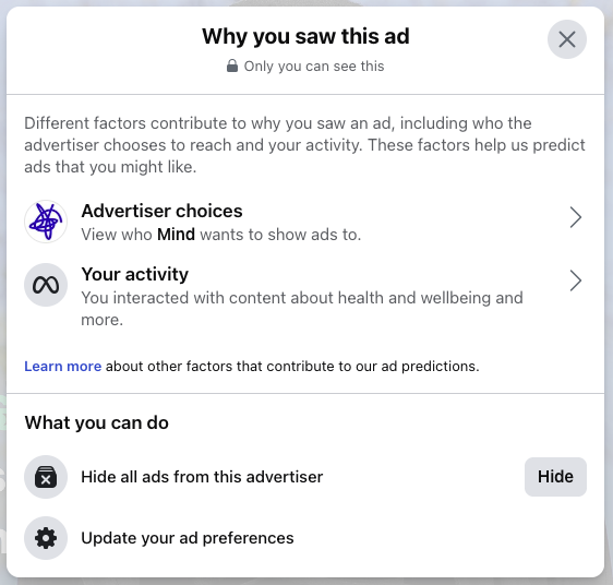
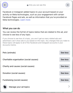
Everything here comes from what’s publicly visible: the ad creative, the “Why am I seeing this ad?” panel, the landing page, the UTM tags, and whatever the Meta Ad Library chooses to show – which may be more if you’re having to include a disclaimer with your ads. Where I’m making an educated guess, I’ll say so.
How to analyse a charity Facebook ad like a strategist
If you want to do this yourself, run every ad through the same questions. That’s the rough blueprint:
- The ask. Is it specific and tangible? “Sponsor a room for £25 a month” lands harder than “please donate.”
- The emotional ;ever. What feeling are the first three seconds buying – fear, hope, guilt, belonging?
- The creative. Video or static, polished or raw, text-on-image overlay. What actually stops the scroll?
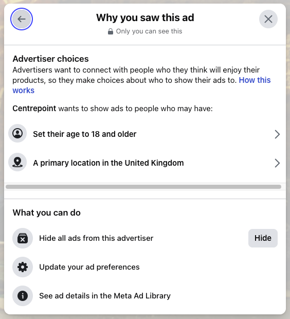
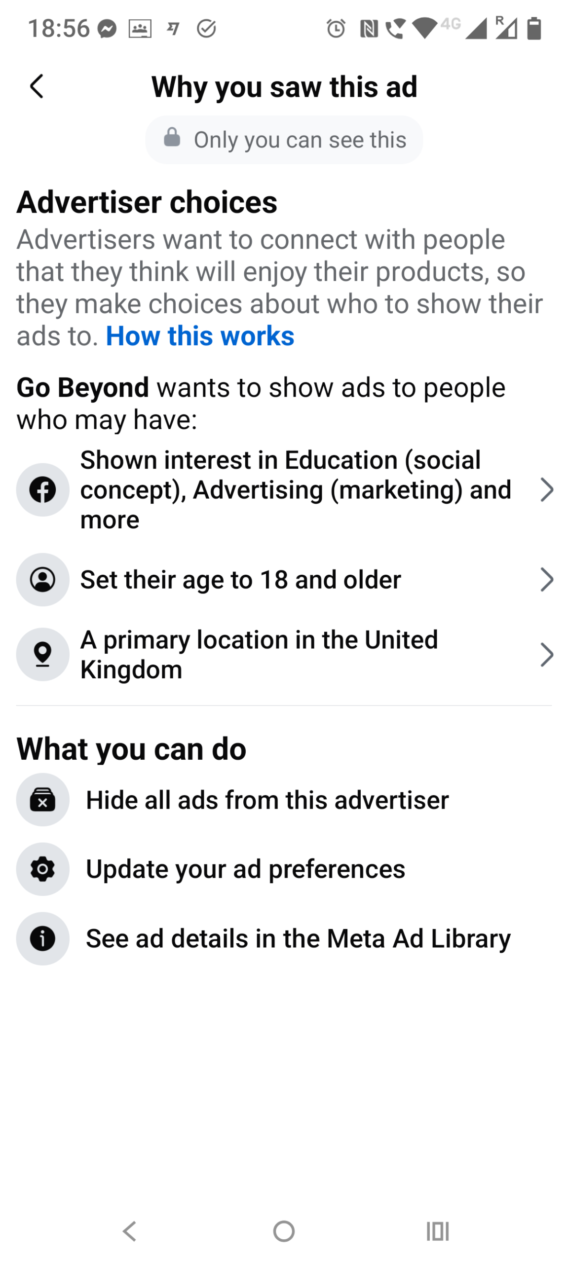
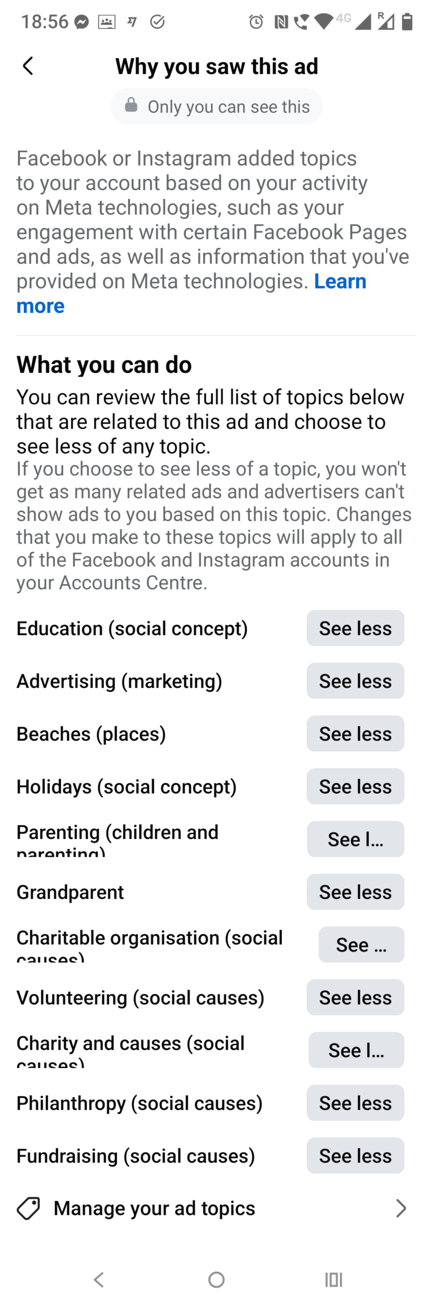
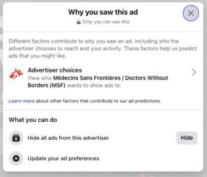
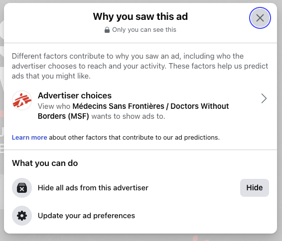
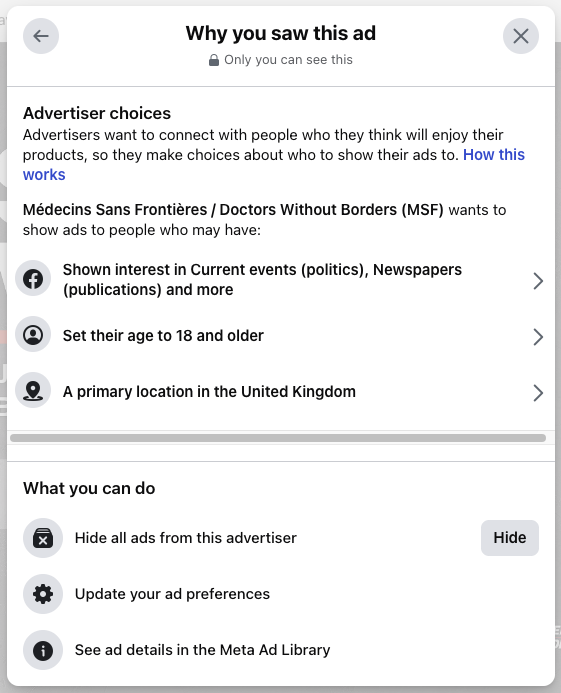
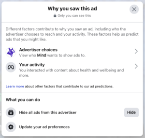
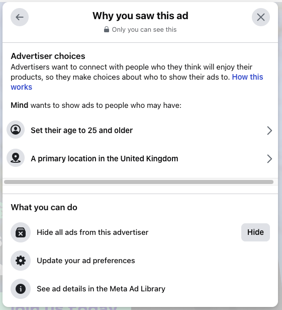
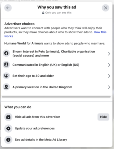
- Targeting clues. The “Why am I seeing this?” panel plus the Ad Library hint at broad prospecting vs. retargeting, and who the charity thinks its donor is.
- Longevity – a clue, not a verdict. A long-running ad suggests the charity is happy to keep spending on it. But it could also be a longer test, or an awareness play where donations aren’t the only goal.
- Message match. Does the ad’s creative carry through to the landing page? Lack of continuity leaks money.
- Tracking. UTM tags, multiple creative versions, named-individual storytelling – signs of an established programme.
- What you’d test. End on one thing you could try.
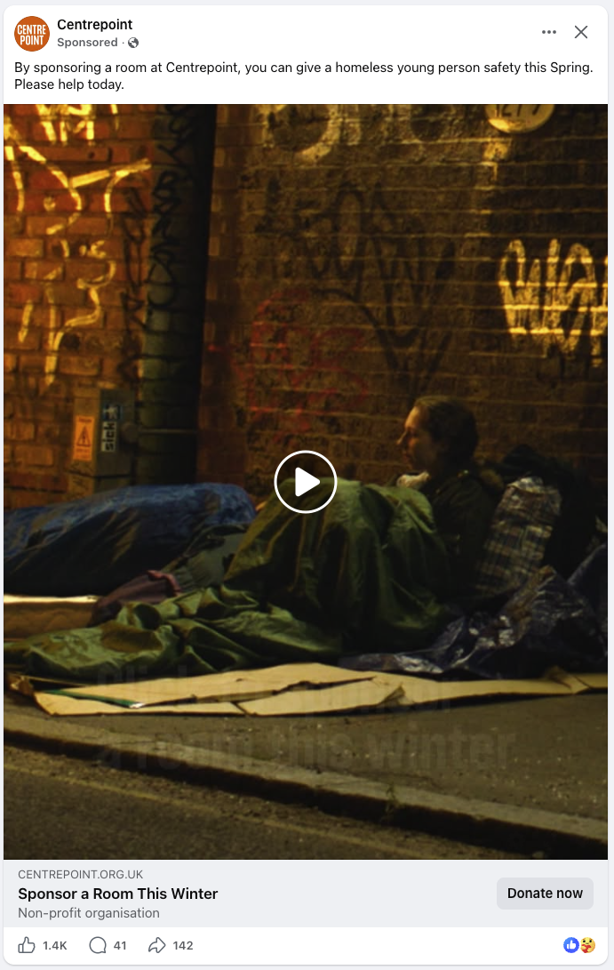
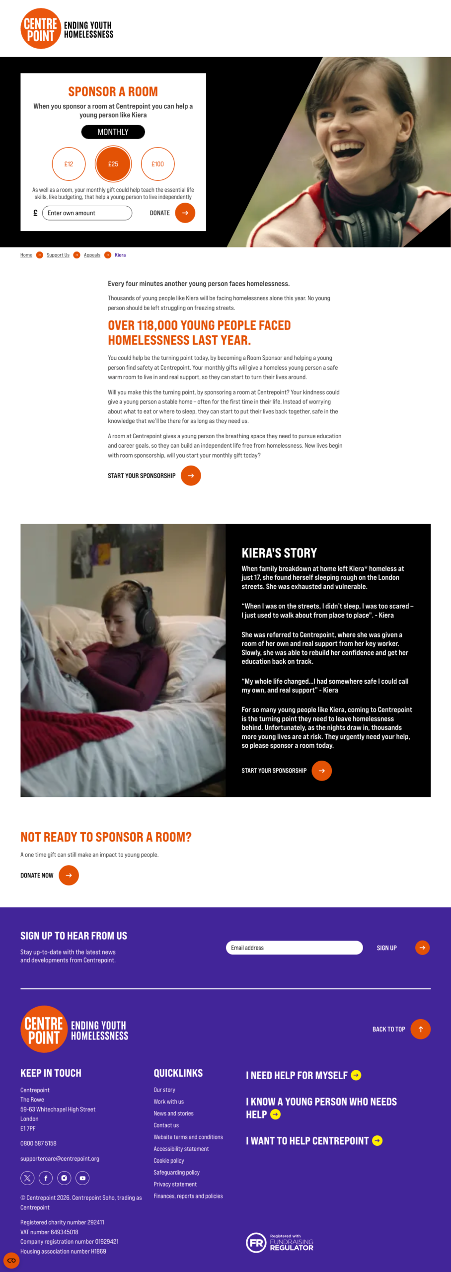
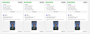
1. Centrepoint – “Sponsor a Room” (the Kiera appeal)
- Charity: Centrepoint (youth homelessness)
- Landing page: centrepoint.org.uk/…/kiera-sar
- Ad Library: Library ID 1581870259702466
- Main text: “By sponsoring a room at Centrepoint, you can give a homeless young person safety this Spring. Please help today.”
- Title / CTA: Sponsor a Room This Winter / Donate now
- Running: Since 20 March 2026 – 95 days, with 4 ads sharing this creative
- Reach: ~258,000 UK accounts; UK-wide, all genders, 18–65+
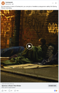

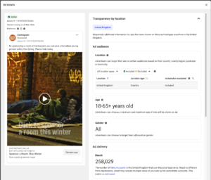
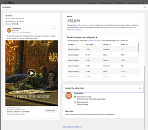
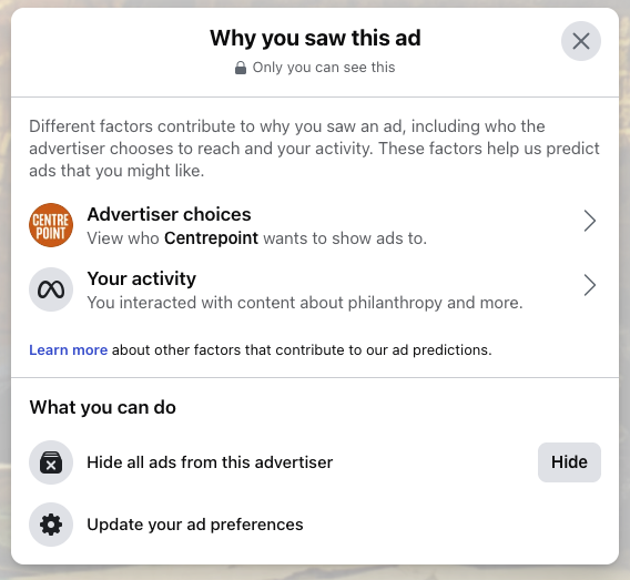


What’s the campaign? The landing page (/appeals/kiera-sar) and the UTM tags (utm_campaign=csarmetallv25) tell us this is a room-sponsorship campaign with a Meta-specific creative variant. It’s been live since 20 March 2026 – though from the outside we can’t tell whether it runs year-round or seasonally.
My thoughts
This looks like a control ad – something Centrepoint has kept live for 95 days, with four variants and serious reach behind it. That level of investment suggests it’s performing well, though they could equally still be testing or running it for awareness; only Centrepoint can see the cost-per-donation. The targeting is deliberately wide (UK, all genders, 18–65+), which suggests to top-of-funnel prospecting / Advantage+ – letting Meta find donors rather than narrowing by interest. The creative does the heavy lifting: a dark, real scene with a “Click to sponsor a room this winter” overlay, paired with a specific, tangible ask – a room, not just “a donation.” And the landing page continues the story with a named young person, Kiera, so the message match is clear.
Test this: Make your ask a specific / tangible – “a room,” “a hot meal,” “a school kit” – instead of just “donate,” and see what it does to your CTR and conversion rate.
One to notice: the title still says “Winter” while the body says “Spring” – evergreen creative that’s outlived its season. Even big charities leave seasonal copy mismatches running. A tidy A/B test: a season-neutral title against the original.
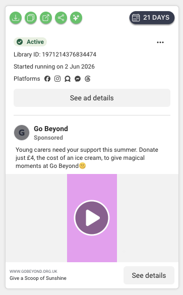
2. Go Beyond (formerly CHICKS) – “Ice Cream Moments / Give a Scoop of Sunshine”
- Charity: Go Beyond (children’s respite breaks; formerly CHICKS)
- Landing page: gobeyond.org.uk/…/ice-cream-moments-2026
- Ad Library: Library ID 1971214376834474
- Main text: “Young carers need your support this summer. Donate just £4, the cost of an ice cream, to give magical moments at Go Beyond ☀️”
- Title / CTA: Give a Scoop of Sunshine / Learn more
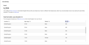
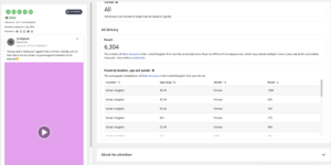
- Running: Since 2 June 2026 – about 21 days
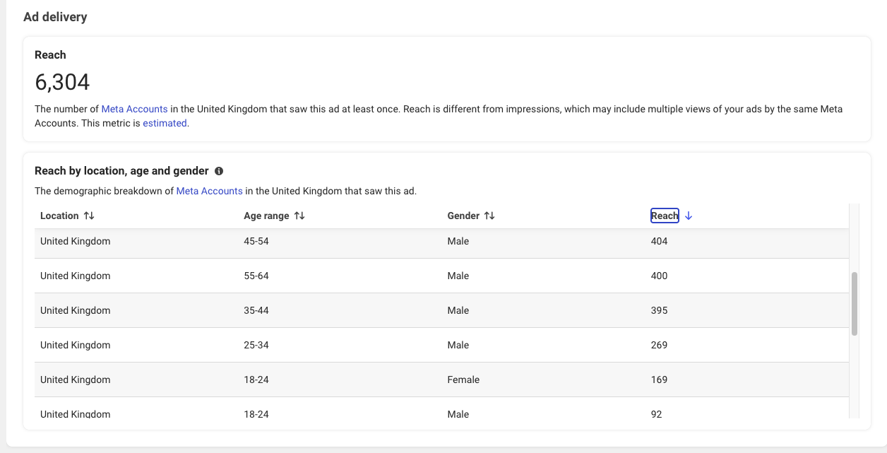
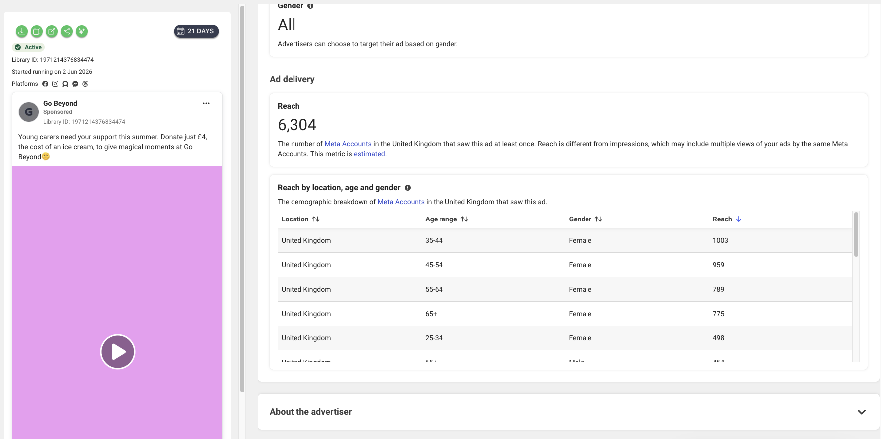
- Reach: ~6,300 UK accounts; UK-wide, 18+, across Facebook, Instagram, Messenger, Threads and Audience Network
- Targeting: Interest-led – charity/causes, philanthropy, fundraising, volunteering, parenting, grandparent, plus holidays and beaches


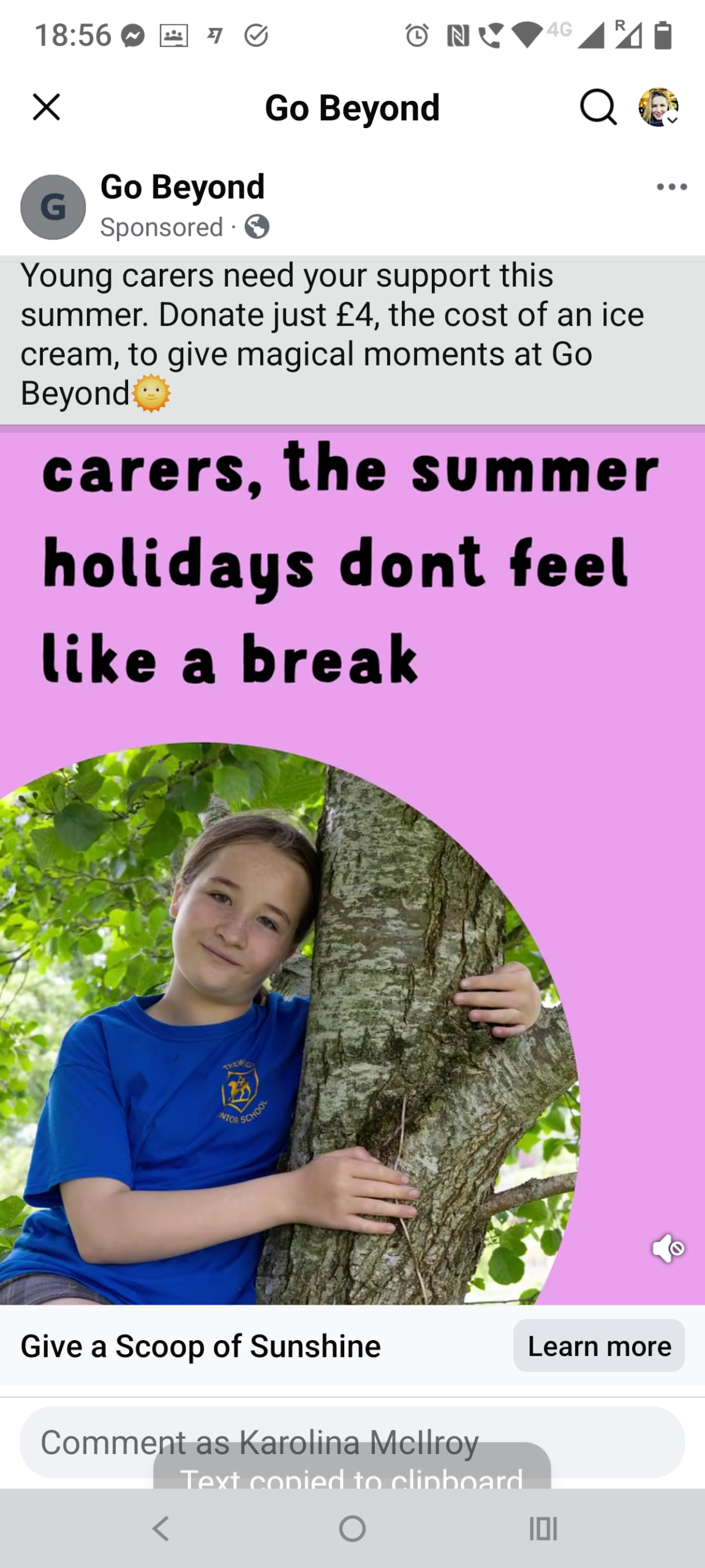
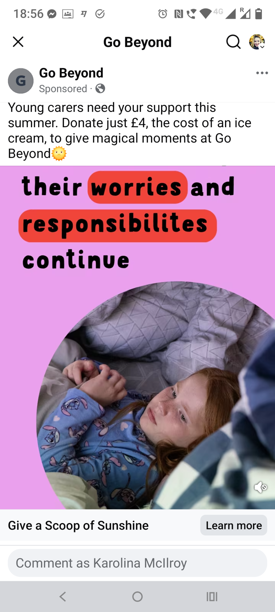

What’s the campaign? “Ice Cream Moments 2026” – a summer appeal asking for £4 to give a vulnerable or young-carer child a “scoop of sunshine” over the holidays. The UTMs are fully tagged (campaign, content, term and ID all populated), and the ad CTA “Give a Scoop of Sunshine” lands on a page headlined “Donate an Ice Cream Moment,” so the branding carries the whole way through.
My read
The standout here is the price anchor. “£4, the cost of an ice cream” reframes the donation as a familiar, everyday treat – easier to say yes to than an abstract sum, and it ties straight into the ice-cream campaign theme. Unlike Centrepoint’s wide-open prospecting, this is interest-led targeting (charity, fundraising, parenting, grandparent), and the public demographic data skews strongly to women 35–65+ – a typical donor profile. The creative is an animated text-overlay video with highlighted words and a scrapbook font; cheap to produce, on-trend, and built to stop the scroll. Two opening lines are in rotation (“their worries and responsibilities continue” vs “the summer holidays don’t feel like a break”), which suggests they’re testing the hook. With only ~21 days live and ~6,300 reach, though, this looks like an early-stage, smaller-budget test – so I’d hold off reading anything into performance yet.
Test this: The £4-ice-cream anchor is the strongest asset – try pulling it into the headline or the video overlay itself, not just the body copy, where more people will see it.
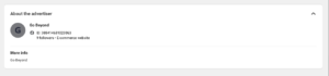
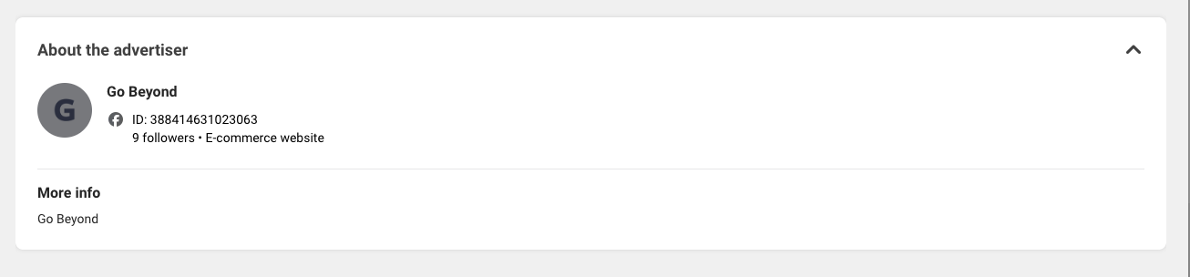
A couple to notice: there are two typos baked into the creative – “responsibilites” and “dont” – the kind of thing that’s quick to fix and quietly dents credibility. And the advertiser’s Facebook Page shows just 9 followers and is categorised as an “E-commerce website” rather than a charity, which points to a new or separate page for this campaign (possibly just after rebranding); low follower counts and an off-brand category can both soften the social proof a cold audience sees. On the plus side, the landing page leans on a Louis Theroux endorsement – smart credibility-building.
3. Médecins Sans Frontières (MSF) – “Stand With Us”
- Charity: Médecins Sans Frontières / Doctors Without Borders (MSF UK)
- Landing page: msf.org.uk/secure/donate/stand-with-us
- Ad Library: Library ID 2124656151612270
- Main text: “Take life-saving action. Become a monthly donor today.” (also running: “Start saving lives now. Become an MSF monthly donor.”)
- Creative copy: “STAND WITH US – Join us, from wherever you are. Become an MSF monthly donor today.”
- Title / CTA: Give £10 a month / Donate now
- Running: Since 23 January 2026 – 151 days, with multiple versions
- Targeting: Interest-led – current events/politics, newspapers, journalism, plus charity, philanthropy, donation and fundraising; 18+, UK. The UTM term flags a lookalike audience (
LAL)


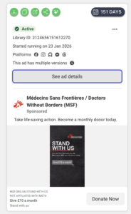
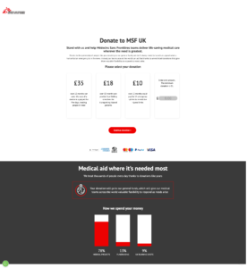
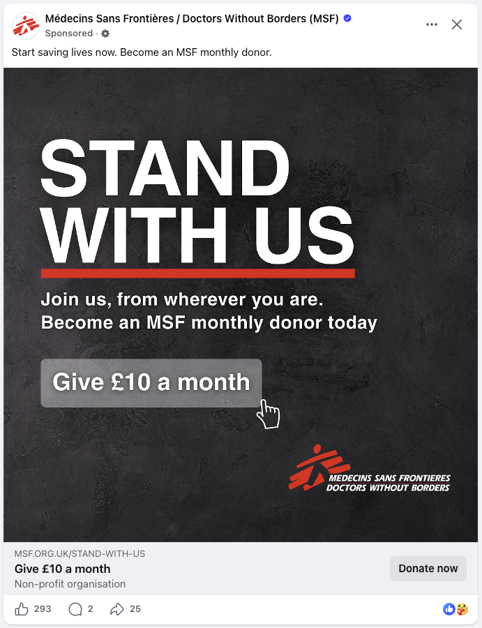

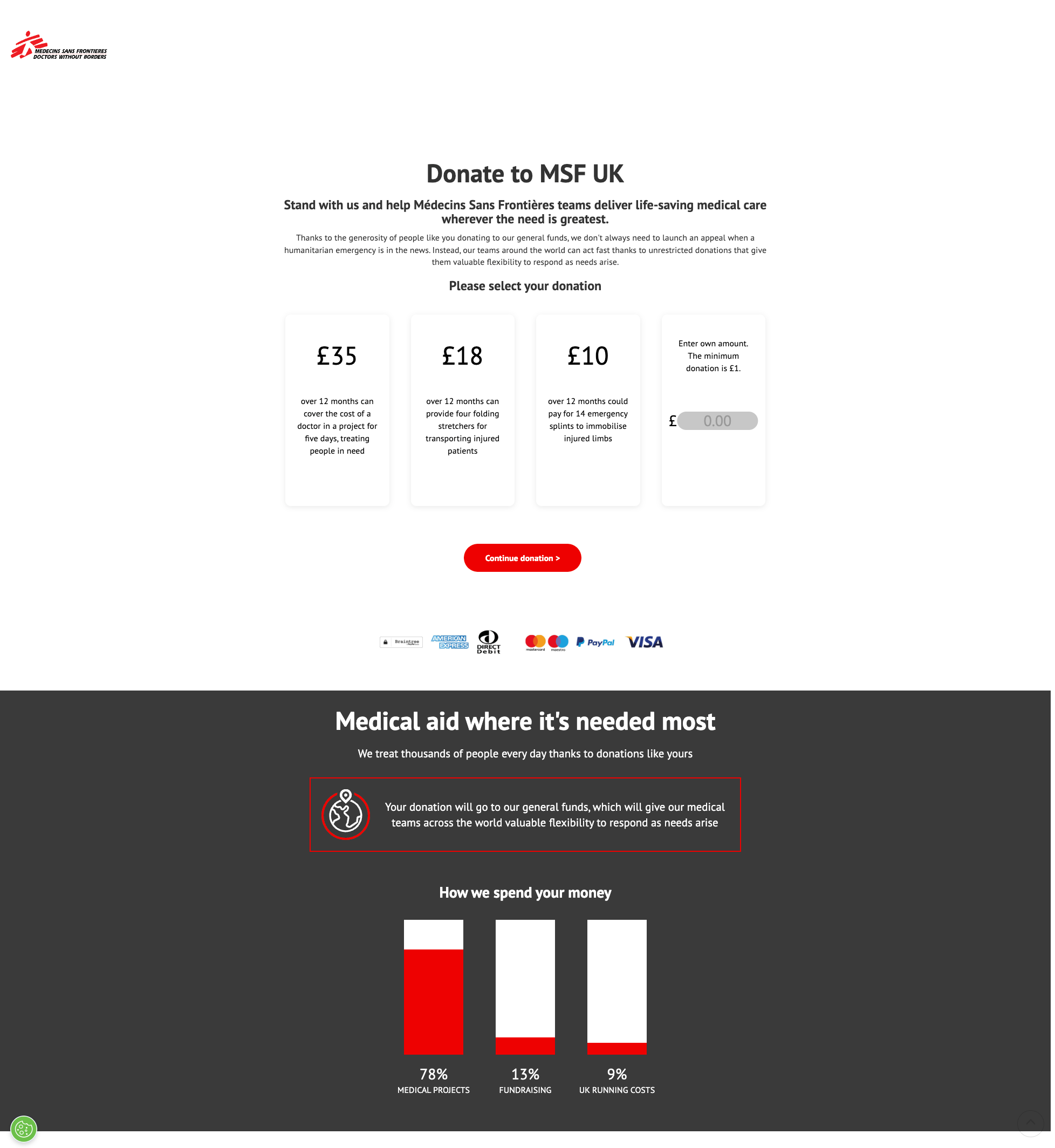
What’s the campaign? A regular-giving acquisition campaign – the UTMs spell it out: utm_campaign=Regular+Giving_Conversion, a Static creative, and an audience term marked LAL (lookalike). The ad CTA “Give £10 a month” lands on a “Donate to MSF UK / Stand with us” page with £10 pre-framed as a monthly tier, so the journey is seamless.
My thoughts
This is the most brand-led ad of the three so far, and the most quietly sophisticated. The lever isn’t pity – it’s solidarity and identity. “Stand With Us” and “Join us, from wherever you are” frame giving as belonging to something, not rescuing someone. The creative is a stark, high-contrast typographic poster (white on black, MSF’s red rule) with a faux button and cursor on “Give £10 a month” – cheap to produce, instantly on-brand, and a deliberate direct-response nudge. Targeting is layered and clever: news- and current-affairs-engaged audiences (newspapers, journalism, politics) sit naturally alongside MSF’s humanitarian positioning, and the LAL tag shows they’re also prospecting from lookalikes of existing donors. It’s been live 151 days with multiple versions, which suggests a core, evergreen regular-giving engine they’re confident in – though, as ever, only MSF can see the cost-per-acquisition. The landing page does the closing: concrete impact at each tier (£10 = 14 emergency splints), plus a transparent “how we spend your money” breakdown (78% medical projects).
Test this: Try a solidarity/identity frame (“stand with us,” “join us”) as an alternative to pity-led appeals – it can lift monthly-donor sign-ups and tends to attract more committed supporters. And borrow MSF’s tiered impact equivalences on your donation page.
Worth noting: MSF is the only ad in this set with no photo of a person in need – just stark type and the brand mark – a bet that the name and the cause can carry the ad on their own, where everyone else leans on a face (which is typically what performs better in comparison). And the “Give £10 a month” panel is styled to look like a clickable button, cursor and all – a classic direct-response nudge overlaid onto the image.
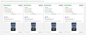
4. Mind – “The system is broken, help us fix it” (regular giving)
- Charity: Mind (mental health)
- Landing page: mind.org.uk/donate/regular-giving-2025
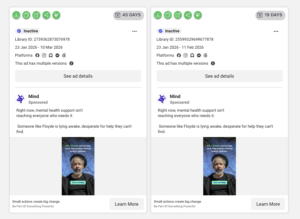
- Ad Library: Library ID 2403333916772124 – now inactive (ran 23 Jan – 10 Mar 2026)
- Main text: “Right now, mental health support isn’t reaching everyone who needs it. Someone like Floyde is lying awake, desperate for help they can’t find.”
- On the creative: “£5 a month could help save the broken mental health system” · button: “Join us today”
- Headline / CTA: “The system is broken, help us fix it” / Donate now (some versions: “Small actions create big change · Be Part of Something Powerful” / Learn More)
- Campaign: Regular giving / monthly donor acquisition (UTM
campaign=rg2627) - Targeting: 25+, UK; a “health and wellbeing” behavioural signal
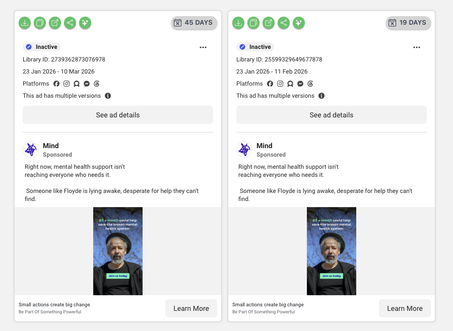
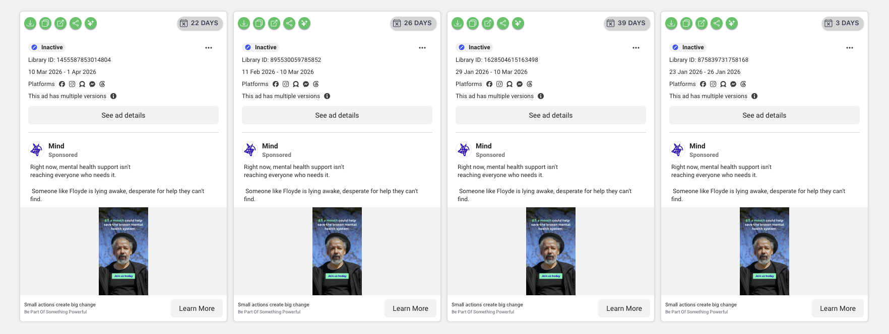
- Volume: the same creative ran as ~10 separate ad instances (durations from 3 to 45 days), all now switched off – a defined Jan–Apr 2026 flight
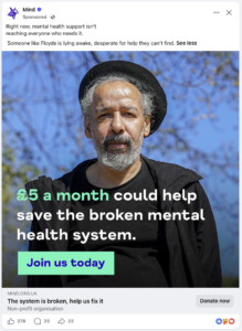


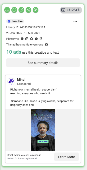
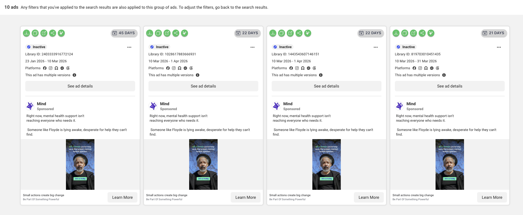
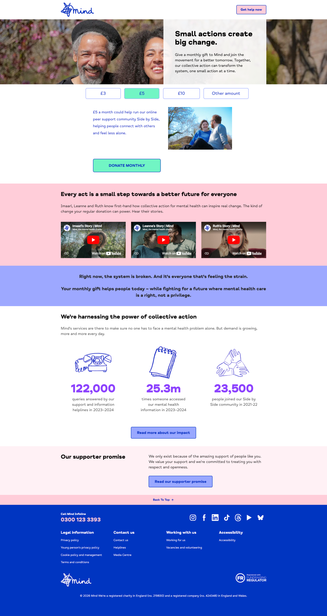
What’s the campaign? A regular-giving push (UTM rg2627 – Mind’s 2026/27 regular-giving programme) converting cold audiences into £5/month donors. The same high-lifetime-value goal as MSF, and the message carries cleanly to the landing page, where £5 is the pre-selected monthly tier under “Small actions create big change.”
My thoughts
At a glance Mind looks like it ran “ten different ads,” but the Ad Library shows all ~10 use the same creative and copy. So this isn’t ten creatives being tested against each other – it’s one strong concept deployed widely across multiple ad instances and run dates (possibly). From the outside we can’t tell exactly why (testing across audiences, splitting by placement or campaign, or simply scaling a control), but the takeaway is that Mind backed a single clear idea hard rather than scattering budget across many messages. The concept itself is a hybrid: a named individual (“Floyde is lying awake”) for empathy, combined with a movement-style frame (“save the broken mental health system,” “Be Part of Something Powerful”) for agency – so the donor is both helping a person and joining something bigger. And crucially the ask sits on the image (“£5 a month…”), not buried in the caption. Everything’s inactive now, but with a clean Jan–early-April run time that reads like a planned campaign end rather than a flop.
Test this: Two lessons. (1) Put the price and the ask on the creative – most people never read the caption. (2) “Testing” isn’t always ten creatives; sometimes it’s finding one strong concept and deploying it properly. Decide which you’re actually doing before you brief the designer.
Worth noting: that’s two of our five (MSF and Mind) are looking for monthly donors rather than one-off gifts – a reminder of the higher-lifetime-value income a regular giver brings.
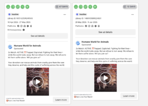
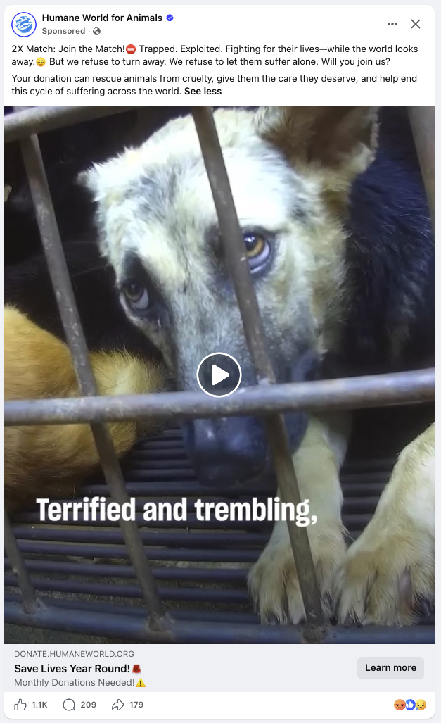
5. Humane World for Animals – “2x Match: ACTIVE”
- Charity: Humane World for Animals (animal welfare; formerly the Humane Society of the United States and Humane Society International)
- Landing page: donate.humaneworld.org/…/donate
- Ad Library: Library ID 1488105089224831 – now inactive (ran 28 May – 9 Jun 2026; an earlier instance ran 10 Apr – 27 May)
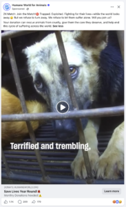
- Main text: “2x Match: ACTIVE. ‼️ Trapped. Exploited. Fighting for their lives—while the world looks away. But we refuse to turn away… Will you join us? Your donation can rescue animals from cruelty… and help end this cycle of suffering across the world.”
- Title / CTA: Save Lives Year Round! / Learn more
- Creative: a 50-second produced rescue video (caged dogs), honestly labelled “2022 footage”
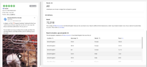
- Reach: ~72,000 UK accounts (12-day instance)
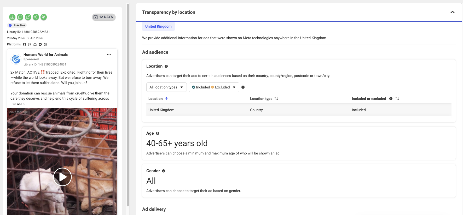
- Targeting: UK, all genders, 40–65+; skews strongly to women 45–65+. The UTMs flag interest-based prospecting to a cold audience
- Campaign: Evergreen sustainers (recurring giving) with a 2x match (UTM
hwfa_evergreen_sustainers_2x_match_2026)
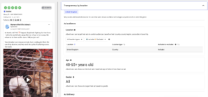
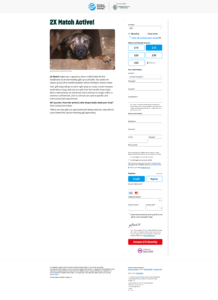
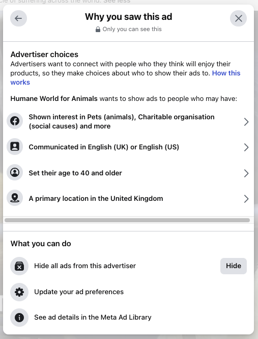
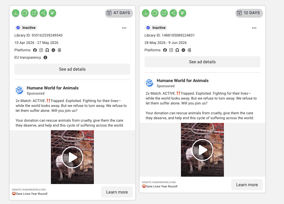


What’s the campaign? An evergreen recurring-giving (“sustainers”) appeal, supercharged with a matched-giving offer. The tracking is the most granular of the five – the UTMs literally spell out the audience (prsp prospecting, int interest, cold), the placement (Facebook Desktop Feed), the creative (a named 50-second video) and the offer (2x match). This is an enterprise-grade, US-import fundraising machine.
My thoughts
The unique selling point and a way to create urgency here is matched giving: “2x Match: ACTIVE” up front tells you your donation is doubled right now – ratehr than it being an always-on recurring ask. It’s paired with the emotionally intense creative of the five: graphic rescue footage and high-distress copy (“Trapped. Exploited… suffer alone”). That intensity clearly works for a committed animal-welfare audience. Two craft details worth respecting: the video is labelled “2022 footage” (good transparency – it doesn’t imply the clip is current), and the whole funnel is tagged so tightly they’ll know exactly which audience, placement and creative drove each gift. As ever, it’s now inactive – but the “evergreen” label suggests a programme that runs in refreshed flights rather than a one-off that flopped.
Test this: Borrow the live-match mechanic if you can – a “2x Match: ACTIVE” flag adds genuine urgency to an evergreen recurring ask without inventing a fake deadline. And always label archival footage (“2022 footage”) – it’s honest and it pre-empts complaints.
One to notice: this is very US-style direct-response copy (‼️, “2x Match: ACTIVE,” high-distress language) pointed at a UK audience. It can absolutely work, but it’s more American than most UK charity comms – worth A/B testing against a softer language, and watching for donor fatigue with the graphic imagery. On the other hand maybe this is the scroll-stopping factor it needs to gran attention? The ads are no longer live, but this is likely due to the limited time for the double donation campaign.
What the five have in common
Almost every ad makes the ask specific – a £25 room, a £4 ice cream, £5 or £10 a month, a doubled donation – rather than a vague “please give.” Three of the five (MSF, Mind and Humane World) are chasing recurring monthly donors rather than one-off gifts, because the lifetime value is so much higher (mind you so is the price tag of acquiring one from cold). And the emotional levers span a real range – from empathy and rescue (Centrepoint, Humane World) to solidarity and movement-building (MSF’s “Stand With Us,” Mind’s “Be Part of Something Powerful”). The one thing none of us can read from the outside is what actually converts – so treat all of this as ideas to test, not gospel.
That’s the file for this month
None of this is a verdict on what’s “best” – it’s a read on what’s worth studying. If you spot a charity ad you’d like pulled apart, send it my way and if you want to see more of these posts – add your details below and I will drop you a line when the next post lands.
Frequently asked questions
Written by Karolina McIlroy, founder of kmac digital – award-winning paid social and search marketing for UK charities. The Swipe File is a monthly-ish pick of charity ads that caught my attention.